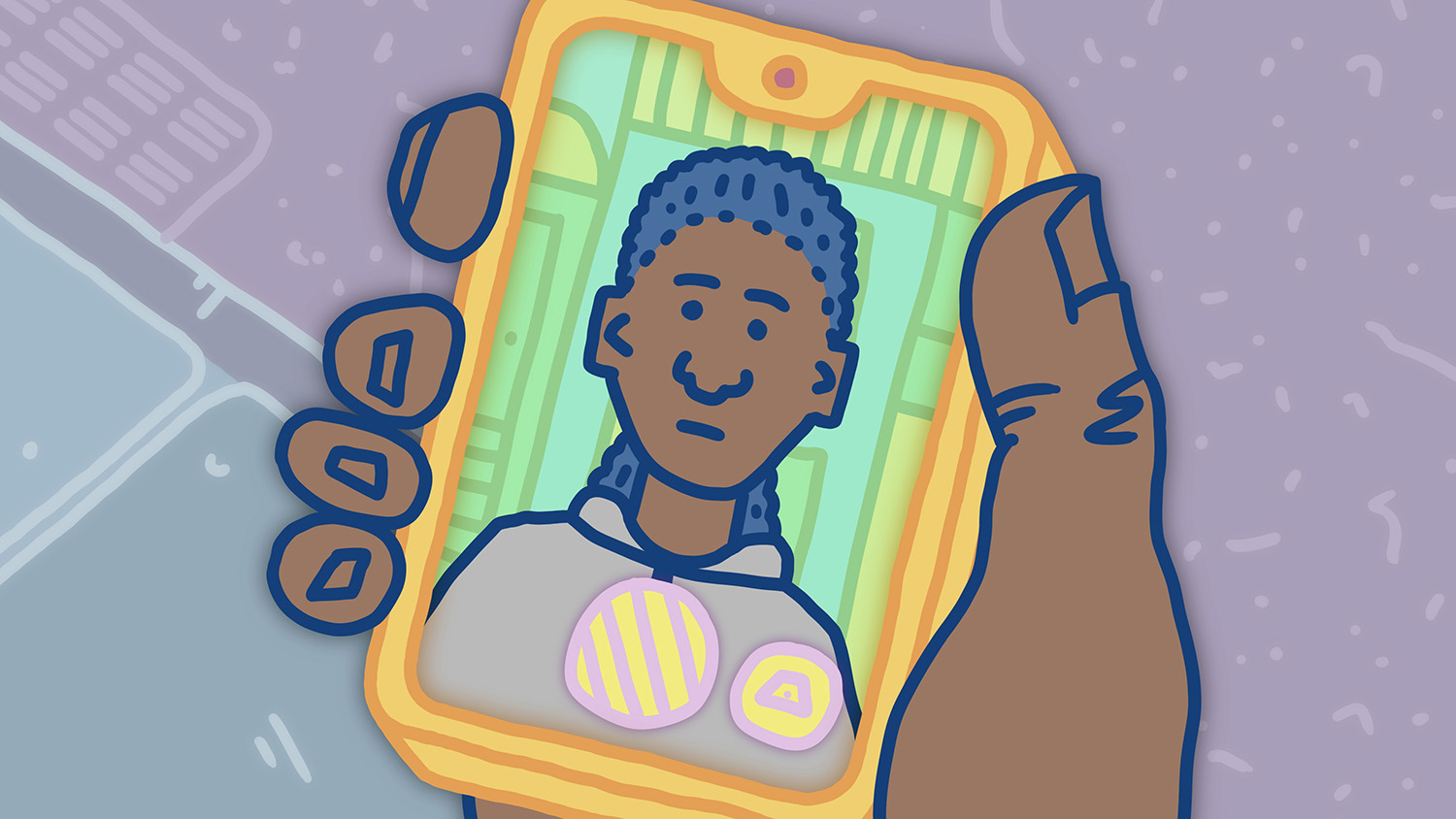
Mercy Care
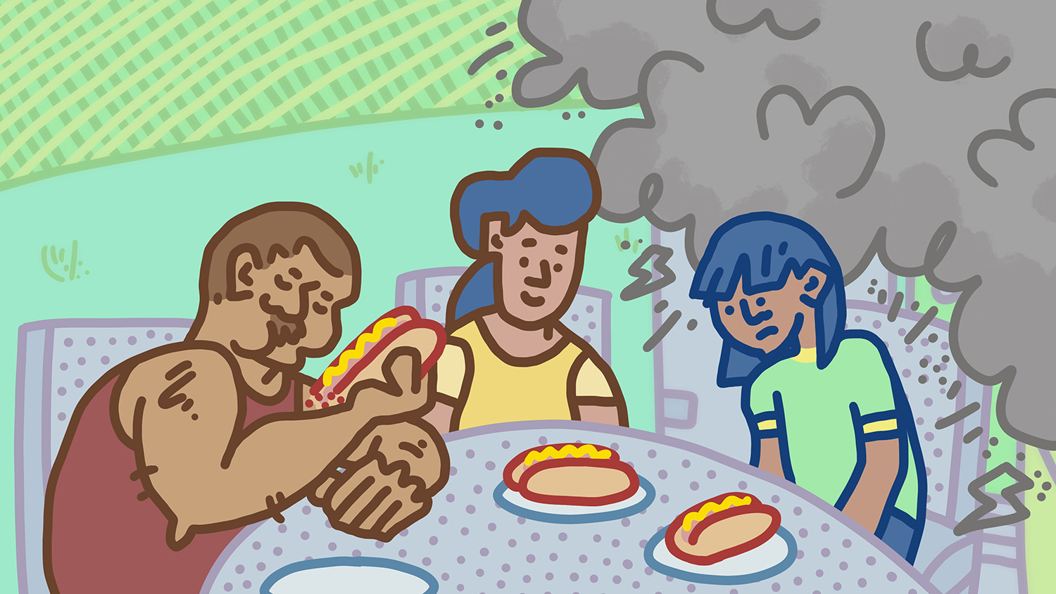
Mercy Care is a small healthcare company. They asked me to animate two commercials about mental health, and they provided the voiceover and a broad outline. I built out the story more, sketching familiar scenes from childhood barbecues like kids playing and Dad grilling.
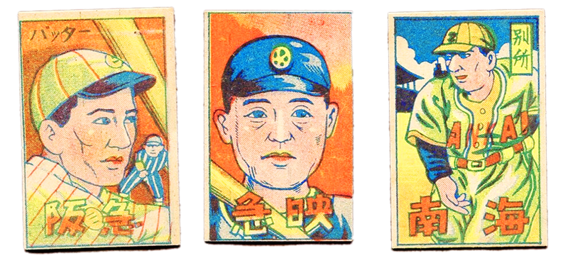
For the style, I wanted to try something a little different. I was reading a book on Japanese baseball cards, and I thought the clean blue lines and big shapes would provide a dignified look, appropriate for the subject matter but still friendly and encouraging.

Gender Swap
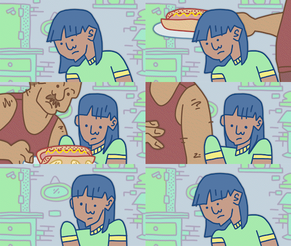
The company had one big request: they wanted two versions of each commercial, one with a young woman main character and one with a young man.
Making different versions can be time-consuming. But I pride myself on being organized, and I build my project files carefully! After drawing the new character frames, it was easy to slot them into the old project file and export the new commercials.